Deciphering the Prolonged Yield Curve Inversion

The possibility of the most recent yield curve inversion started to attract attention in early 2022. Short-term U.S. Treasury yields had been rising much faster than long-term yields, nearly overtaking them.
The yield curve can invert at various points or maturities. One commonly examined measure is the yield spread between 10- and two-year Treasuries. This spread officially went negative (i.e., the yield curve inverted) on April 1, 2022, with the two-year yield ending the day higher than the 10-year yield. While short-lived, the curve inverted again a few months later, on July 6, and has remained inverted ever since. See Figure 1.
Figure 1 | The Treasury Curve Has Remained Inverted for Nearly Two Years
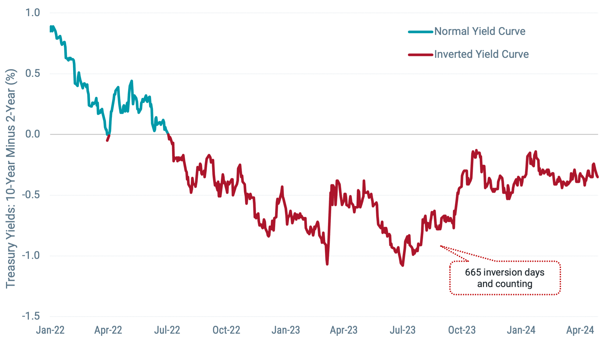
Data from 1/1/2022 - 4/30/2024. Source: FRED. Past performance is no guarantee of future results.
A bond's yield refers to the expected earnings realized on a fixed-income investment over a period of time, expressed as a percentage or interest rate.
What we’ve observed from the Treasury curve over the last two years is notable for a few reasons. First, the current period of inversion has been notably lengthy. Since 1976, it’s the longest sustained inversion at 655 days and counting as of April 30. The second longest period lasted 623 days from August 18, 1978, to May 1, 1980, although the curve was inverted again for much of 1981 and 1982.
Second, while historically, yield curve inversions have sometimes been followed by recessions, as shown in Figure 2, it’s far from a bulletproof rule. There simply haven’t been many past observations by which to assert strong conclusions. Contrary to what people feared from the current inversion, the U.S. economy today is four years into an expansion period with few signs pointing to its end in the near term.
Figure 2 | While Many Past Inversions Have Preceded Recession, It’s No Guarantee
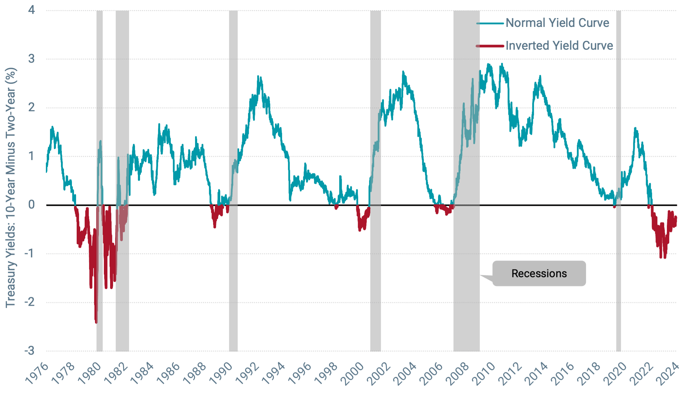
Data from 6/1/1976 - 4/30/2024. Source: FRED. Past performance is no guarantee of future results.
For example, consecutive quarters of negative gross domestic product (GDP) growth are often considered a possible signal for recession. GDP growth has been positive for six straight quarters, although first-quarter growth this year was lower than a year earlier (1.6% vs. 2.2%). Unemployment has also held low (3.8%).
The yield curve remains inverted today, so only time will tell if a recession ultimately ensues. Nevertheless, that we’ve gone this long without a recession serves as a cautionary reminder against presuming that what’s happened in the past is sure to happen again in the future, especially when there isn’t enough data to support definitive conclusions.
If you don’t find that convincing, also consider that before 1976, there were times when recessions occurred (1957-1958, 1960-1961) with no preceding inversion and an inversion in 1966 when a recession didn’t follow soon after. In short, correlation isn’t the same as causation. That two things have happened close to one another in the past doesn’t definitively mean that one caused the other.
Many considerations may affect the shape of the yield curve that aren’t directly linked to a recession. For instance, supply and demand play a role, and the supply of U.S. government-issued debt has changed dramatically over the past several years. Since the start of 2020, the Treasury market has grown more than 60% to nearly $27 trillion as of the end of March. See Figure 3.
Figure 3 | Total Value of Treasuries Outstanding Has Grown More than 60% Since 2020
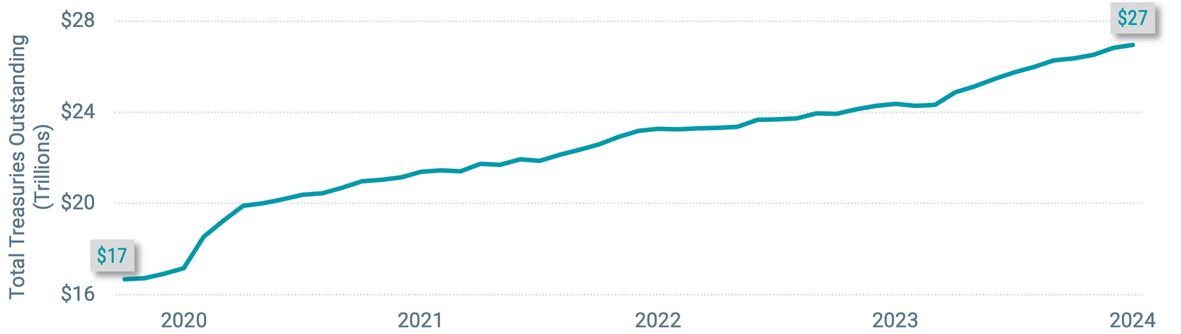
Data from 12/31/2019 - 3/31/2024. Source: U.S. Department of the Treasury. Past performance is no guarantee of future results.
The makeup of issuance has also shifted significantly from before and after the yield curve inverted in 2022. Figure 4 shows the breakdown of annual net issuance between short-term Treasury bills versus longer-term notes and bonds.
Figure 4 | Short-Term Debt Has Dominated Treasury Issuance Since the Yield Curve Inverted
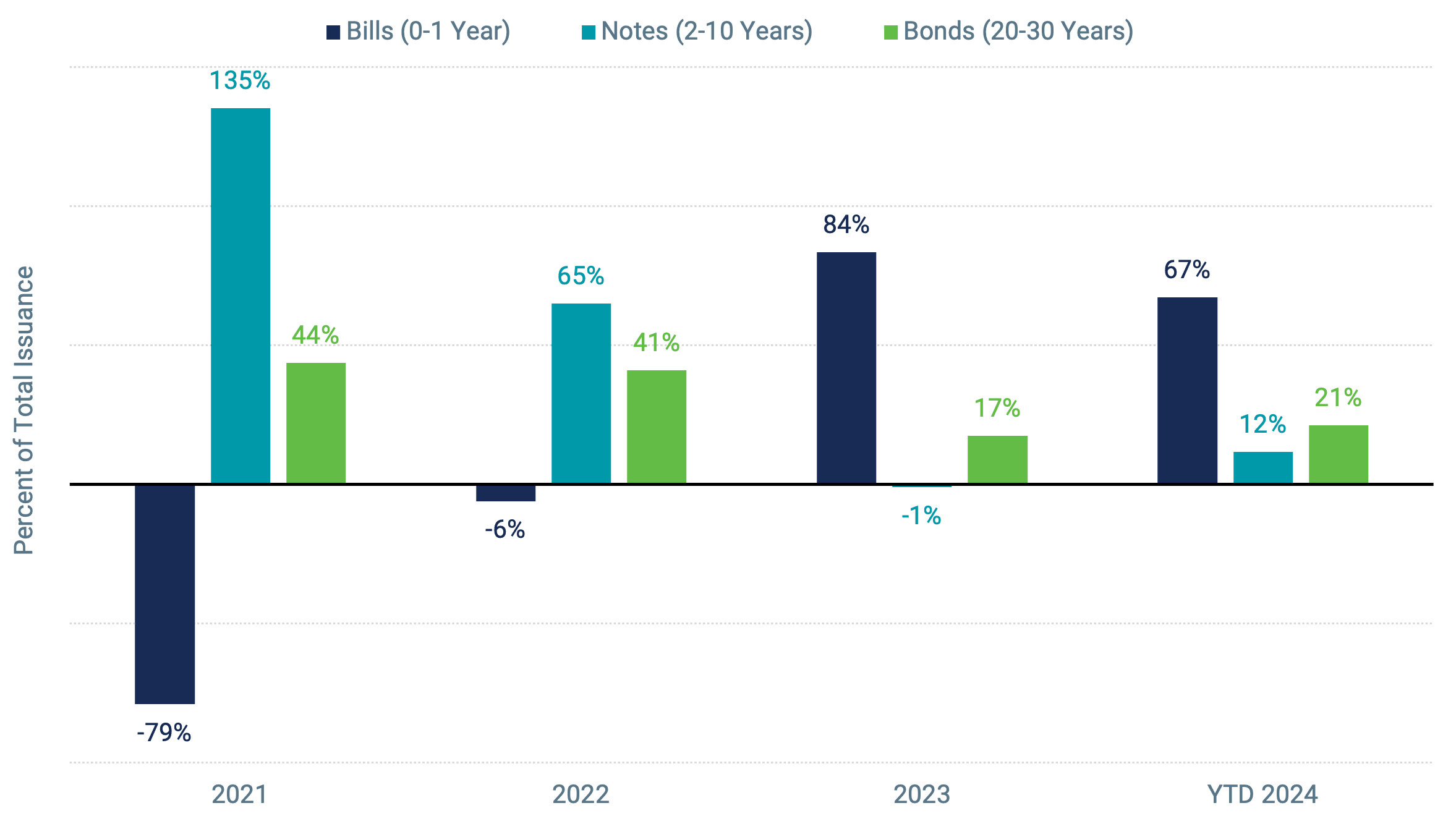
Data from 1/1/2021 - 3/31/2024. Source: U.S Department of the Treasury. Past performance is no guarantee of future results.
In 2021, the net issuance of short-term Treasuries (bills) was sharply negative, meaning more bills were retired/matured than new bills issued. Longer-term notes led net positive issuance. That shifted, with short-term debt dominating new Treasury issuance in 2023 and 2024.
While, again, it’s difficult to assign explicit causation, it’s likely that heightened supply, particularly among short-term Treasuries, affects the yield curve. Investors may require higher yields (lower prices) to absorb the supply if the short-term bond supply is higher. In effect, when the supply of short-term bonds is high, it can create upward rate pressure on the short end of the curve.
At the same time, some believe that investors also aren’t currently demanding higher yields to hold longer-term bonds, which may contribute to lower yields on longer-maturity bonds. One possible explanation is that the increase in issuance of longer bonds during the period of low rates has satisfied investor demand for longer durations.1
The critical point is that there are different theories explaining why yield curves sometimes invert and break from their normal typical upward slope. While recessions may sometimes follow an inversion, it doesn’t have to be the case that an inversion predicts a recession or that an impending recession causes an inversion.
Setting aside theories, we can also consider the practical implications of the investor anxiety often associated with yield curve inversions. Let’s say an investor, fearing the worst at the onset of the current inversion period on July 6, 2022, sold out of their stock portfolio on that day. Would they have fared better, having been out of the market since then? The market index returns shown in Figure 5 suggest otherwise.
Figure 5 | Markets Have Delivered Strong Returns Since the Yield Curve Inverted in 2022
Data from 7/7/2022 – 3/31/2024. Source: Morningstar. It is not possible to invest directly into an index. Past performance is no guarantee of future results.
More broadly, this example highlights why we should resist the urge to draw too firm a conclusion from historical correlations, especially when sparse data drives them. Seemingly, we can find correlation anywhere.
For instance, the number of movies Johnny Depp appeared in each year from 2017 to 2023 closely paralleled the number of wins by the Los Angeles Chargers during the same period.2 Similarly, from 1990-2020, there was a strong positive correlation between American cheese consumption and patents granted in the U.S.3 While these perceived connections are fun to think about, we think it’s unlikely that picking up more cheddar at the grocery store will drive the next wave of American innovation.
Explore More Insights
Eric Wallerstein, “The $27 Trillion Treasury Market Is Only Getting Bigger,” Wall Street Journal, March 24, 2024.
Tyler Vigen, “The Number of Movies Johnny Depp Appeared in Correlates with Season Wins for the Los Angeles Chargers,” Spurious Correlations, January 2024.
Tyler Vigen, “U.S. Production of Cheese (Other Than Cottage Cheese) Correlates with Patents Granted in the U.S.,” Spurious Correlations, January 2024.
Glossary
Gross Domestic Product (GDP): A measure of the total economic output in goods and services for an economy.
High-Yield Bonds: Fixed income securities with lower credit quality and lower credit ratings. High-yield securities are those rated below BBB- by Standard & Poor's.
Inverted Yield Curve: An interest rate environment in which long-term debt instruments have a lower yield than short-term debt instruments of the same credit quality.
MSCI ACWI Index: A capitalization-weighted index that is designed to measure the equity market performance of developed and emerging markets.
MSCI Emerging Markets Index: Captures large-, mid- and small-cap securities across 27 emerging markets countries.
MSCI World ex USA Index: Captures large-, mid- and small-cap representation across 22 of 23 developed markets countries, excluding the U.S.
Russell 3000® Index: Measures the performance of the largest 3,000 U.S. companies representing approximately 98% of the investable U.S. equity market.
S&P 500® Index: A market-capitalization-weighted index of the 500 largest U.S. publicly traded companies. The index is widely regarded as the best gauge of large-cap U.S. equities.
Treasury Yield: The yield of a Treasury security (most often refers to U.S. Treasury securities issued by the U.S. government).
U.S. Treasury Securities: Debt securities issued by the U.S. Treasury and backed by the direct “full faith and credit” of the U.S. government. Treasury securities include bills (maturing in one year or less), notes (maturing in two to 10 years) and bonds (maturing in more than 10 years).
Yield Curve: A line graph showing the yields of fixed income securities from a single sector (such as Treasuries or municipals), but from a range of different maturities (typically three months to 30 years), at a single point in time (often at month-, quarter- or year-end). Maturities are plotted on the x-axis of the graph, and yields are plotted on the y-axis. The resulting line is a key bond market benchmark and a leading economic indicator.
Investment return and principal value of security investments will fluctuate. The value at the time of redemption may be more or less than the original cost. Past performance is no guarantee of future results.
This material has been prepared for educational purposes only. It is not intended to provide, and should not be relied upon for, investment, accounting, legal or tax advice.
Generally, as interest rates rise, the value of the bonds held in the fund will decline. The opposite is true when interest rates decline.
The opinions expressed are those of the portfolio team and are no guarantee of the future performance of any Avantis fund.